Default System: A Futuristic Display Font for Digital Branding
It started with a hero section that felt… safe. Too safe. I was polishing a landing page for a creative tech coaching brand—think sleek dark mode, subtle gradients, and crisp SVG illustrations—and the headline just sat there. No spark. No tension. No sense of forward motion. So I swapped in Default System, typed “Build Your Next System,” and watched the whole layout exhale. Suddenly, it wasn’t just clean—it was charged.
What Default System Brings to the Screen
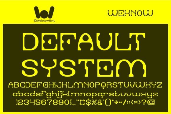
Default System is a Techno display font—sharp, geometric, and unmistakably futuristic without tipping into parody. Think precision-engineered letterforms: tight counters, consistent stroke contrast, terminals that snap like circuit traces, and a subtle digital pulse in the rhythm. It’s not retro-futurism or vaporwave; it’s tomorrow’s interface, rendered in thoughtful typography. As a display font, it’s built for impact—not endurance—and that distinction matters deeply in web design.
I tested it across real contexts: a portfolio site’s project title, a course sales page CTA button, a blog header over a blurred background, and even a small animated banner in a newsletter preview. In every case, Default System added visual authority and thematic cohesion—especially when the brand concept leans into innovation, digital craft, or systems thinking.
Where It Shines (and Where to Pause)
On large, high-contrast displays? Brilliant. On mobile viewports at 24px? Still legible—but only as a headline. I found its sweet spot between 32–64px on desktop and 28–40px on mobile, always with generous letter-spacing (I used 0.05em as a starting point). Its clarity holds up well over image overlays, especially with a subtle text shadow or background tint for contrast.
But let’s be practical: Default System isn’t for body copy. Not even close. Its personality is too strong, its spacing too deliberate, and its character set optimized for brevity—not scanning. I tried it for a testimonial block at 18px. It looked cool in the mockup—but users scrolled right past it. The brain had to work too hard. For accessibility and readability, it belongs strictly in display roles: hero titles, section headers, feature cards, branded buttons, and short accent phrases (“Beta Launching Soon”, “API Ready”, “System Live”).
Navigation menus, form labels, error messages, or dense dashboard tables? Skip it. Those need neutrality, speed, and universal recognition—qualities best served by a robust sans serif like Inter, Manrope, or even system fonts.
Pairing It Right for Web Clarity
The magic of Default System isn’t in isolation—it’s in contrast. I paired it with Inter (a highly readable, open-source sans serif) across three client projects, and the hierarchy became intuitive: Default System sets the tone; Inter delivers the information. No fighting for attention. No stylistic whiplash.
For editorial-leaning sites—a designer’s blog or a tech publication—I tested it with a restrained serif like IBM Plex Serif. The juxtaposition created quiet sophistication: the Techno font whispered “future,” while the serif grounded it in credibility and voice. Just avoid pairing it with other decorative or script fonts—the result feels cluttered, not curated.
One note on weights: Default System includes a single bold weight (no light, medium, or italic variants in the base set). That’s fine for display use—but plan accordingly. If your design relies on typographic nuance across headings, you’ll want to lean on size, spacing, and color instead of weight variation.
Technical Fit for Real Projects
I loaded Default System via self-hosted WOFF2 files (the smallest, fastest-loading format) and confirmed full support across Chrome, Safari, Firefox, and Edge. No rendering hiccups—even with font-display: swap enabled for performance. No fallback surprises. The glyphs are cleanly hinted, and characters align predictably in flex and grid layouts.
Before deploying, I checked the license: yes, it includes commercial web use—critical for client sites and SaaS dashboards. No hidden restrictions on pageviews or domains. Also confirmed multilingual support covers Latin-based languages (including accented characters for French, Spanish, German), but not Cyrillic or CJK. Perfect for global English-first brands, less so for fully localized interfaces.
Pro tip: if you’re using it in Figma or Adobe XD for handoff, export the font file and share it with developers—or embed it directly in your design system tokens. Consistency starts before code.
When “Futuristic” Means “Focused”
What surprised me most about Default System wasn’t how sci-fi it looked—but how purposeful it felt. It doesn’t shout “look at me.” It says, “this is where the system begins.” That makes it unusually effective for brands building tools, platforms, or frameworks—where clarity, structure, and forward momentum matter more than whimsy.
I’ve since used it for a no-code dashboard preview, a generative art portfolio tagline, and a limited-edition digital product launch. Each time, it elevated the perceived polish without sacrificing authenticity. It doesn’t pretend to be friendly—it’s confidently precise. And in a web landscape full of generic rounded sans serifs, that kind of intentionality stands out.
If your project lives at the intersection of human-centered design and technological imagination, Default System isn’t just a font choice. It’s a quiet declaration of alignment.